Branding is so much fun.
It’s all colors and fonts and all things pretty.
Right?
Well… almost.
Branding is a bit more like baking a cake.
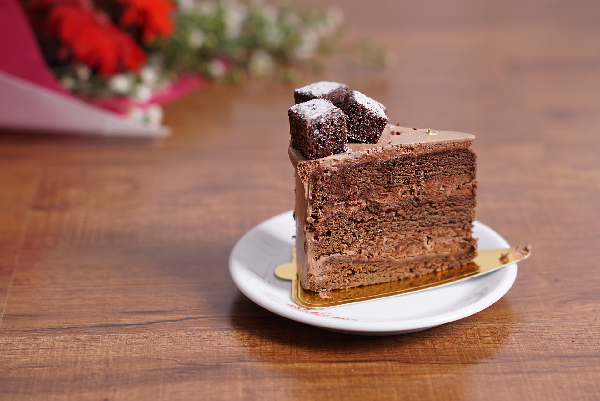
Do you have a favorite cake recipe? Like a REALLY good recipe, all from scratch, like your gramama used to make?
Close your eyes for a second, and imagine that cake.
Feel the texture in your mouth, see the gloss of the frosting or glaze, imagine the smell when it comes out of the oven.
Go ahead, I’ll wait.
I know, I know. You’re hungry for cake now.
You’re welcome.
So let’s get back to it, shall we?
Imagine your idol is coming over for dessert. You know exactly what cake you’re going to make. (In case you care, Sting is happening in my imagination right now, and I’m making my dad’s chocolate cake…)
Now, imagine you see your neighbor on your way to get the mail and they ask what you’re doing that evening. You say “YOU’LL NEVER GUESS!!! STING is coming to my house for cake! CAKE! STING! CAN YOU IMAGINE?!?!?!?” (And yes you can, because you’re you, and you’re here, and you have a wild and vivid imagination…)
And do you know what your neighbor says?
“Why not just grab a mix and some store-bought frosting?”
[oh no he didn’t]
(It’s at this point you realize you can never look your neighbor in the eye again.)
And you smile, and nod, and walk quickly away because can you even imagine STING eating a BOXED CAKE?!?!?
The horror.
Branding is a bit like that.
If you feel like you’re good with a quick logo in Paint, picking a few colors, and finding a fun font, you’re serving Sting a boxed cake.
Don’t do that.
Don’t serve STING a boxed cake.
Here’s what I wish everyone knew about branding.
It’s more than just your favorite color.
Color psychology is a real thing, and color choice matters. But also, it doesn’t matter. You want to use colors that reflect you, your brand, and make sense. You don’t want a nice shouting color if your brand reflects calm, peace, and serenity.
Imagine trying to find peace and serenity in a ball pit.
Color matters.
Be consistent.
Make sure your users are getting the same message from you on Facebook, Twitter, Instagram, your website, and your brick-and-mortar shop.
It really does matter.
Each impression counts, and the more consistent you are, the more your customers will know how to identify you!
Figure out your story.
What’s your mission? Who do you serve? What core values matter to you and your brand? This message crafts everything else – including the colors and fonts you choose. Who ARE you? What do you want to represent you? What message should your clientele receive?
It’s ok to be YOU.
In fact, it’s really encouraged. Are you a bit cheeky despite living in a professional world? Let that come through! There is a blend of your personality to be found – and you should find it! Are you a health coach who loves bright colors? Let’s make that HAPPEN! You don’t have to do what everyone else is doing. Let’s find the perfect intersection of who you are and who you want to be. THAT is where the magic happens.
Branding is so much more than the colors of a box cake and the fonts of store-bought frosting.
Make your cake! Pay attention to the details!
Your customers will notice.
